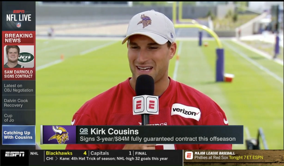
ESPN’s BottomLine Will Have New Look Come Monday
Preview the next phase of ESPN's innovative, pacesetting news and info ticker

When ESPN debuted the BottomLine in 1995, the news and information “ticker” was heralded for its ingenuity and innovation. Similar usages soon became ubiquitous across any number of news and sports networks.
The BottomLine’s newest design will begin rolling out across ESPN networks on Monday with inspiration coming from mobile messaging apps and a “form follows function” mindset.
“All of its features – including type, color and motion – were purposely chosen to make the graphic as legible and effective as possible within the same footprint as the previous version,” ESPN Creative Services creative director Michael Ruddy said.
Viewers likely will notice the elimination of team logos and a switch from scrolling text to text that instead flips, reducing the frustration of missing part of a news summary and having to wait for it to scroll by again.
“The streamlined design of the BottomLine will help us enhance our comprehensive editorial coverage – from breaking news to schedules, stats, and news and information that sports fans demand quickly and accurately,” said Kristie Blasi, senior director of ESPN Stats & Information. “Our fans will see a new presentation of our industry-leading content.”
The BottomLine has evolved over the years, most recently in 2014, but the purpose remains the same: to consistently and constantly serve sports fans.
In the video below, Front Row offers a special preview of the new design prior to its launch on Monday.
Kimberly Elchlepp contributed to the post.
ESPN Creative Services produced the video.


