EDITOR’S NOTE: The video above demonstrates how the Starting XI tool works. Build your lineups at espn.com and learn how they compare to Team USA’s projected starting 11.
The United States Women’s National Team (USWNT) officially starts its quest for a third consecutive FIFA Women’s World Cup title this weekend in New Zealand, which is co-hosting the 32-nation tourney with Australia.
Coach Vlatko Andonovski has the challenge of choosing 11 starters from a 23-person star-studded roster, including 14 with no previous World Cup experience. Andonovski will have a standout side ready for its Group E debut match tonight at 9 ET in Auckland versus Vietnam.
https://twitter.com/espn/status/1681485648136491009
The question the Visual Storytelling Division of ESPN’s Creative Studio poses fans is, “Who’s Your USWNT Starting XI?” The interactive feature, published July 17 on ESPN.com, encourages fans to assemble their starting lineups – using players’ projected scoring metrics and scouting reports as their guide – to produce “the ultimate goal machine.”
Give it a whirl.
Look closely as you draft your championship side, and you’ll see how a selected player “reacts” when chosen (demonstrated in the video above, explained below).
Front Row asked three members of the project team to explain how this challenge came together: creative director Luke Knox, senior editor Elaine Teng, and art director Rami Moghadam.
What inspired this feature?
Knox: The idea for this project originated from the Visual Storytelling division of ESPN Creative Studio, which shapes everything from TV graphics to film key art to digital presentations. We pitched this interactive game because of the USWNT’s incredibly deep 2023 roster — fans always love to second-guess the coach, and there are endless lineups to try.
The breakthrough was when our team found a treasure trove of data to power the results since our group specializes in translating unique info into immersive digital experiences that fans can understand. After multiple design iterations and rigorous testing, the project launched just as the Women’s World Cup was about to begin.

What were the primary challenges of building the feature, and how did your team identify and overcome them?
Moghadam: As project designer, I worked closely with Luke and developer Bryant Smith to find the ideal user interface of the game, particularly for the 11-player selections (a heavy demand on the general ESPN.com audience accustomed to scrolling).
This required multiple design iterations and prototypes to make sure we settled on an intuitive and user-friendly approach. Storytelling lead Dominique DeMoe worked with Elaine to narrow down the mountain of available data, using strategic thinking about our audience to feature the most engaging metrics.
Photo editors Jason Potterton and Matt Becker faced another challenge in researching and treating player headshots consistently. This involved deep photo research and subtle uniform adjustments for consistency throughout the experience.
What’s the story behind the xG metric that’s important to building a lineup?
Teng: Expected goals, or xG, is a metric that came out about 10 years ago, and it transformed how soccer fans think about the game – for better or worse! There’s nothing more frustrating than your team having super high xG but not scoring. In this case, we thought it would be a clever, concrete way to capture the USWNT’s achievements and quantify individual player’s success.
The @USWNT kicks off its quest for a 3rd straight World Cup title Friday at 9:00pm ET vs Vietnam.
Ahead of the tournament, @ESPNFC has released an interactive tool that allows you to decide your starting lineup, powered by TruMedia & @StatsPerform!https://t.co/QfPCliW0Oa pic.twitter.com/M9dLCWYXne
— TruMedia (@TruMediaSports) July 17, 2023
What’s the reaction been to the feature?
Knox: The project has gotten a very positive reaction from fans. It led the homepage of ESPN.com on Monday morning, and though fans are still consuming it today, total pageviews should land around 150,000. The average time spent, which is 0:30 for a standard article, hovered around 1 minute, 15 seconds, so we know fans are engaging fully.
Data partners Stats Perform and TruMedia [ see Tweet above]posted it on their social platforms. It gives us another tool in our storytelling toolbox.
How did visuals enhance the “game” aspect of the project for fans?
Knox: Visual Storytelling always tries to purposefully use visuals to inform and delight our audience, which was certainly the case here. Check out the player headshots, for one.
If you look closely, the players’ faces go from neutral expressions to smiles when you select them; how cool is that?
Beyond that, there are various data visualizations throughout (color-coded tables, bar charts, and an interactive shot heatmap) for fans inclined to dig further into the stats.
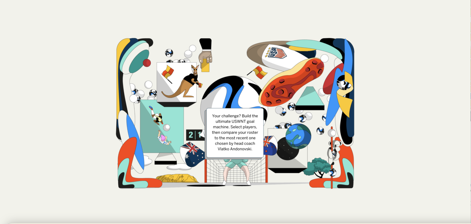
And colorful illustrations were peppered throughout, which injected a sense of fun and energy as we taught fans about the expected goals metric. This project asked people to process a high volume of statistics and interaction in a short time, so visuals were our secret weapon to keep them engaged and interested.
Moghadam: To maximize the impact of visuals, Visual Storytelling can also incorporate lively animations to help the story come to life. We did so here for big illustration moments, where multiple layers of the artwork move to create a sense of depth, and smaller moments, such as the player selections, where subtle animated gestures help guide the user.
ESPN Press Room: Comprehensive News and Information Coverage of the 2023 FIFA Women’s World Cup